Unlocking the secrets of signage for the Paris 2024 Olympic and Paralympic Games

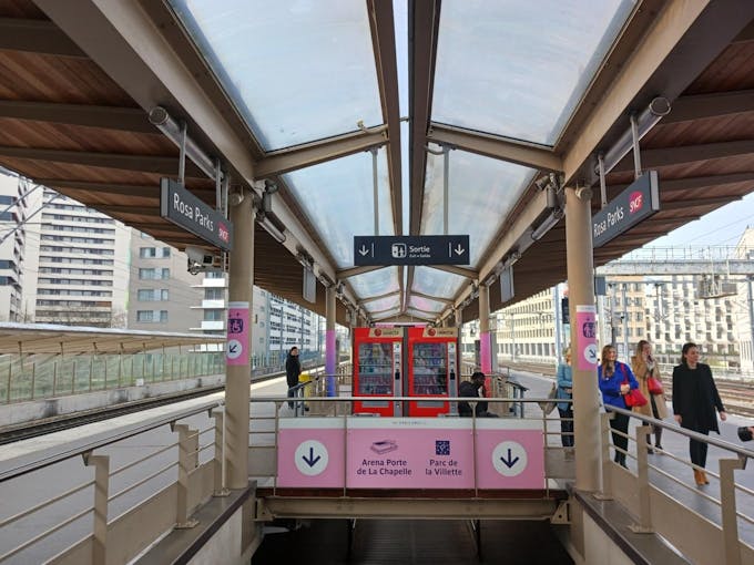
Rosa Parks adorns the Paris 2024 Games colours
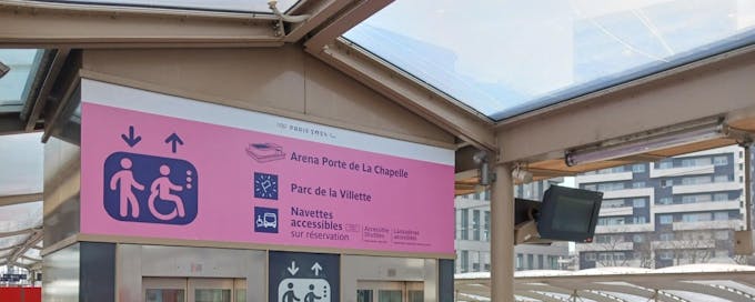
Rosa Parks station in the 19th arrondissement is now adorned in vibrant pink, unveiling the exclusive signage designed for the Paris 2024 Olympic and Paralympic Games.
During the Paris 2024 Games, this RER E station will serve the Arena Porte de la Chapelle venue (Badminton and Rhythmic Gymnastics during the Olympic Games, Para Badminton and Para Weightlifting during the Paralympic Games) and the Parc de la Villette venue (which will host Club France and the Parc des Nations). That’s a good reason for it to serve as a showcase for the presentation of the Paris 2024 Olympic and Paralympic Games signage.
By 24 July, this signage will grace around a hundred train stations in Île-de-France. Meanwhile, Camille Yvinec, Director of Identity for the Games, shares insights into its meticulous design process.
What is signage, and why is it important?
With 10 million spectators expected throughout the duration of the Olympic and Paralympic Games, signage is crucial to ensuring everyone has the best possible experience.
What exactly is signage?
Signage encompasses a range of visual elements, including signs, numbers, pictograms, text, colours, and symbols. It serves as a visual language, conveying permissions, prohibitions, and directions, ultimately guiding and simplifying the journey for spectators as they navigate their way to the competition venues. By facilitating seamless navigation, signage ensures that attendees can travel unhindered and enjoy the events to the fullest.
The challenge of integrating the signage into the existing landscape
The bustling metropolis of Paris and the wider Île-de-France region boast a diverse array of signage across its metro, stations, buses, and streets, each entrenched in its own graphic language and heritage. The challenge confronting the Paris 2024 Games signage was to carve out a distinctive yet seamlessly integrated visual identity that could command attention amidst this existing visual cacophony.
“It was essential that the signage blended harmoniously, especially in places where the Paris 2024 Games identity wasn’t present,” explains Camille Yvinec. "Our task entailed achieving visual coherence between the Paris 2024 Games style and its surrounding environments, ensuring that this signage not only embodied the ethos of the Olympic and Paralympic Games but also served as a beacon for spectators seeking their way."
Involving all concerned
Camille Yvinec and her team undertook this task with a commitment to inclusivity, consulting extensively with key stakeholders involved in transport across Île-de-France. This included Île-de-France Mobilités and the operators RATP and SNCF, but also with the different municipalities and institutions hosting the Olympic and Paralympic venues.
This collaboration was essential to ensure that the signage was understood and effectively displayed by all stakeholders, welcoming and guiding visitors from all over the world to the competition venues in the best possible conditions,
"This collaboration empowered us to leverage local knowledge and expertise, facilitating the integration of adjustments to guarantee the
effective rollout of signage tailored to the specific requirements of each location and user demographic," explains Camille Yvinec
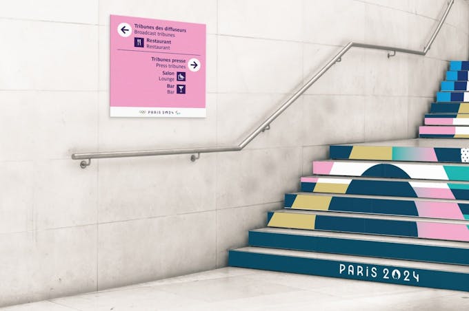
Pink, purple and crystal clear
The hallmark of the Paris 2024 Games signage lies in its simplicity and clarity, anchored by a royalty-free typeface meticulously chosen to meet the needs of all stakeholders involved. Complementing this straightforward design is a striking and distinctive colour - pink.
Pink: a colour of contrast
Pink is joyful and optimistic, powerful, resolute and even a little provocative - "in line with the French spirit" - which echoes the great celebration that these Olympic and Paralympic Games will be.
But pink is also seen as a colour of contrast, so that the visual identity of Paris 2024 can stand out from the other colours used in the Ile-de-France environment.
"This pink also functions as a link between the different locations - competition venues, train and metro stations, bus and tram stops, festive places and places linked to the Olympic and Paralympic Games organisation", explains Camille Yvinec .
Universal and accessible design
Beyond the colour, welcoming the world to the Île-de-France region meant designing signage that was accessible - and understandable - for everyone.
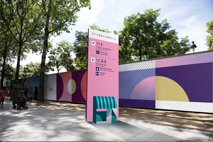
Presented in both French and English, the signage for the Paris 2024 Games is based on a system of universal pictograms and on representations of Ile-de-France locations and monuments in the style of architectural drawings.
Architectural wonders
“What we wanted with these pictograms of the Olympic and Paralympic venues was to capture the architectural and heritage essence of each location. “Instead of depicting venues in a fragmented or isolated manner, we chose to represent them holistically” explains Camille Yvinec.
For example, the Saint-Quentin en Yvelines Vélodrome is represented from an angle which highlights its distinctive character and its integration into the urban landscape. Les Invalides is symbolised by its iconic dome, even though the competitions will take place on the adjacent esplanade.
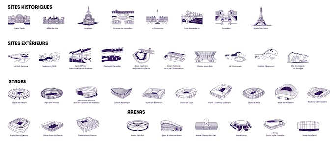
“This approach allows us to visually communicate the idea that the Paris 2024 Games are taking place in iconic and historic locations. By focusing on the most recognisable architectural features of each venue, we seek to evoke a certain magic and a sense of wonder among spectators and participants ".
Accessibility for all
Our foremost priority in designing this signage was to ensure maximum accessibility, especially for individuals with reduced mobility or visual impairments.
We worked in close collaboration with organisations and groups representing people with disabilities. “We worked closely with the Federation of the Blind and Amblyopic of France to ensure that our visual elements were accessible to the visually impaired,” explains Camille Yvinec. As a result, our efforts have been met with resounding success. The strategic use of pink, coupled with text written in purple, achieves a remarkable colour contrast of 83.6%, surpassing the 70% threshold mandated by international standards in this domain. In essence, this means that the texts, signs, or pictograms associated with the Olympic and Paralympic Games will be exceedingly legible.
This accessibility issue has also resulted in the development of detailed guidelines concerning size and scale ratios to guarantee optimal visibility of information, for people standing or in wheelchairs: reading distance, character size and the positioning of signs depends on traffic flows.
Agents to inform and guide
While our universal signage will serve as a crucial navigational aid, it will be complemented by a human presence comprising thousands of station agents and Paris 2024 volunteers. Easily identifiable by their distinctive purple vests, these dedicated individuals will be on hand to provide assistance and guidance to spectators.

Attractive but above all effective signage
As we prepare to unveil our signage across every corner of Île-de-France, particularly within the transport network, our guiding principle remains clear: efficiency trumps aesthetics.
"The emphasis has always been on contextualisation and relevance," asserts Camille Yvinec. “Our goal is to ensure that the signage not only aligns with the stylistic essence of the Games but, more importantly, fulfils its core mission of orienting, guiding, and facilitating movement in the most effective manner possible.”